Brand Identity
🗂️ about
Tosai is a consulting and M&A advisory firm focused on high-risk and complex sectors, working with banks, investors, and strategic partners.
This brand book contains:
Logo System - variations, spacing and incorrect usage
Colour System - palette and usage
Typography System - typefaces and hierarchy
Messaging Basics - tagline + elevator pitch
logo system
The Tosai logo represents confidence, modernity and balance, designed to look approachable and sophisticated. There are two variations of it - a horizontal logo and a logomark. The logomark is inspired by the Hanko, as an ode to Tosai’s Japanese roots.
🗂️ about
Tosai is a consulting and M&A advisory firm focused on high-risk and complex sectors, working with banks, investors, and strategic partners.
This brand book contains:
Logo System - variations, spacing and incorrect usage
Colour System - palette and usage
Typography System - typefaces and hierarchy
Messaging Basics - tagline + elevator pitch
logo system
The Tosai logo represents confidence, modernity and balance, designed to look approachable and sophisticated. There are two variations of it - a horizontal logo and a logomark. The logomark is inspired by the Hanko, as an ode to Tosai’s Japanese roots.








colour system
Tosai’s palette reflects its balance of stability and boldness — grounded in deep neutrals and accented by a sophisticated teal that signals confidence and modernity.Tosai’s core colours reflect its identity — confident, composed, and modern. Each colour plays a specific role in defining the brand’s tone across digital and print. Secondary colours extend Tosai’s visual system, adding warmth, depth, and flexibility for data, interfaces, and presentations.
typography system
Tosai’s typography styles are web-safe, highly readable, and designed for scalable UIs. Captures Tosai’s dual personality — bold yet composed, strategic yet approachable.
Deep Charcoal - Base, text, and primary dark color
#15151D
RGB (21, 21, 29)
CMYK (28%, 28%, 0%, 89%)
Tosai Teal - Accent color for highlights, buttons, and key visuals
#00B8A0
RGB (0, 184, 60)
CMYK (100%, 0%, 13%, 28%)
Off-White - Neutral base and primary light colour
#F7F7F5
RGB (247, 247, 245)
CMYK (0%, 0%, 1%, 3%)
Warm Gray - Secondary mid-tone neutral
#C4BEB6
RGB (196, 190, 182)
CMYK (0%, 3%, 7%, 23%)
Slate Blue - Mid-tone for subdued backgrounds and accents
#44515C
RGB (68, 81, 92)
CMYK (26%, 12%, 0%, 64%)
Soft Sand - Secondary light colour
#E3DED7
RGB (227, 222, 215)
CMYK (0%, 2%, 5%, 11%)
Muted Brass - Accent color for highlights and key lines
#B7A06A
RGB (183, 160, 106)
CMYK (0%, 13%, 42%, 28%)
Stone Gray - Secondary deep gray colour
#8A8884
RGB (138, 136, 132)
CMYK (0%, 1%, 4%, 46%)
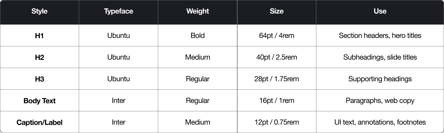
typography system
Tosai’s typography styles are web-safe, highly readable, and designed for scalable UIs. Captures Tosai’s dual personality — bold yet composed, strategic yet approachable.
typography system
Tosai’s typography styles are web-safe, highly readable, and designed for scalable UIs. Captures Tosai’s dual personality — bold yet composed, strategic yet approachable.
Primary Typeface - for Headlines / Titles
Ubuntu
A humanist sans-serif with gentle curves adds personality and warmth without losing professionalism.
Secondary Typeface - for Body / Supporting Text
Inter
A clean, neutral, and screen-optimized font that balances Ubuntu’s character with structure and composure.
MESSAGING BASICS
This section defines Tosai’s core verbal identity elements used in short-form communication and visual applications. The tagline and elevator pitch should be used in presentations, about pages, and corporate summaries.
Primary TAGLINE #1
“Advisory for the Bold”
Concise, assertive, and captures Tosai’s confidence in navigating complex industries.
Primary TAGLINE #2
“Where Risk Meets Strategy”
Direct and institutional, reinforcing Tosai’s authority in high-stakes decision-making and complex markets.
elevator pitch
Tosai is a consulting and M&A advisory for the bold — partnering with banks, investors, and innovators to bring clarity and structure to high-risk, high-potential sectors.
Open to product design opportunities and selected brand/web partnerships.
© 2026 · Built on Framer. Optimised for Web.
colour system
Tosai’s palette reflects its balance of stability and boldness — grounded in deep neutrals and accented by a sophisticated teal that signals confidence and modernity.Tosai’s core colours reflect its identity — confident, composed, and modern. Each colour plays a specific role in defining the brand’s tone across digital and print. Secondary colours extend Tosai’s visual system, adding warmth, depth, and flexibility for data, interfaces, and presentations.
Deep Charcoal - Base, text, and primary dark color
#15151D
RGB (21, 21, 29)
CMYK (28%, 28%, 0%, 89%)
Tosai Teal - Accent color for highlights, buttons, and key visuals
#00B8A0
RGB (0, 184, 60)
CMYK (100%, 0%, 13%, 28%)
Off-White - Neutral base and primary light colour
#F7F7F5
RGB (247, 247, 245)
CMYK (0%, 0%, 1%, 3%)
Warm Gray - Secondary mid-tone neutral
#C4BEB6
RGB (196, 190, 182)
CMYK (0%, 3%, 7%, 23%)
Slate Blue - Mid-tone for subdued backgrounds and accents
#44515C
RGB (68, 81, 92)
CMYK (26%, 12%, 0%, 64%)
Soft Sand - Secondary light colour
#E3DED7
RGB (227, 222, 215)
CMYK (0%, 2%, 5%, 11%)
Muted Brass - Accent color for highlights and key lines
#B7A06A
RGB (183, 160, 106)
CMYK (0%, 13%, 42%, 28%)
Stone Gray - Secondary deep gray colour
#8A8884
RGB (138, 136, 132)
CMYK (0%, 1%, 4%, 46%)
typography system
Tosai’s typography styles are web-safe, highly readable, and designed for scalable UIs. Captures Tosai’s dual personality — bold yet composed, strategic yet approachable.
Primary Typeface - for Headlines / Titles
Ubuntu
A humanist sans-serif with gentle curves adds personality and warmth without losing professionalism.
Secondary Typeface - for Body / Supporting Text
Inter
A clean, neutral, and screen-optimized font that balances Ubuntu’s character with structure and composure.
MESSAGING BASICS
This section defines Tosai’s core verbal identity elements used in short-form communication and visual applications. The tagline and elevator pitch should be used in presentations, about pages, and corporate summaries.
Primary TAGLINE #1
“Advisory for the Bold”
Concise, assertive, and captures Tosai’s confidence in navigating complex industries.
Primary TAGLINE #2
“Where Risk Meets Strategy”
Direct and institutional, reinforcing Tosai’s authority in high-stakes decision-making and complex markets.
elevator pitch
Tosai is a consulting and M&A advisory for the bold — partnering with banks, investors, and innovators to bring clarity and structure to high-risk, high-potential sectors.
Open to product design opportunities and selected brand/web partnerships.
© 2026 · Built on Framer. Optimised for Web.